Yesterday was a fascinating study in contrasts. I visited a truly beautiful gym – all white, minimalist, with sleek machines and a calm studio space. The turf was a subtle, inviting green. For me, this was an ideal setting; the design and cohesive aesthetic immediately brought a sense of peace to my mind.
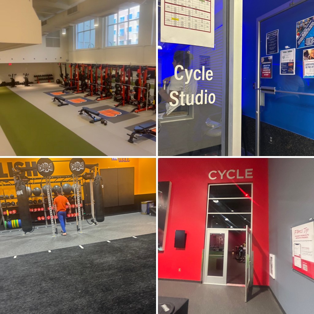
Later that same day, I found myself in a “box gym” – you know the type, the one that screams Barney with its vibrant, almost overwhelming purple and yellow hues. Just days before, I’d been in another that was a sea of aggressive orange. And honestly? My first instinct in those places is to run.
It makes me wonder about the psychology of color in fitness environments. Are these intensely bright, in-your-face palettes consciously designed to evoke a certain high-octane energy? Perhaps. But for someone like me, who has navigated mental health challenges for over 15 years, stepping into a space that feels chaotic or visually overstimulating can immediately heighten anxiety or even trigger past traumas related to movement. It’s the last thing I want – a room that intensifies my internal landscape rather than calms it.
Consider the deliberate choices some studios make. They might call classes “red studio” or use vibrant hues when pushing for high-intensity sprints, while others employ stark contrasts or dim lighting with white light to create a more meditative, introspective mood. Look at SoulCycle’s prominent use of yellow and white versus Peloton’s bold red. Each brand is consciously aiming to convey a specific emotion or drive a particular feeling within their riders.
But here’s the crucial point: when gyms lean too heavily into these extreme color schemes, they risk alienating a significant portion of the population. A person living with mental health issues might walk into such an environment and immediately feel overwhelmed, uncomfortable, or even retraumatized. It’s an unspoken barrier that can drive individuals away before they even get a chance to experience the workout. The environment itself becomes a trigger.
For example, I carry the weight of negative PE experiences from 6th to 11th grade. One particular teacher in 10th grade would constantly belittle our efforts, no matter how hard we tried, whether on the track or in the studio. This kind of environment creates a lasting aversion to movement in spaces that feel similar.
The Psychology of Color in Motion
Colors wield immense psychological power, subtly influencing our moods, energy levels, and even physiological responses. In a fitness setting, these effects are amplified.
- Warm Colors (Reds, Oranges, Bright Yellows): These are often associated with high energy, excitement, and urgency. In small doses, they can be motivating. However, for individuals managing conditions like anxiety (GAD) or bipolar disorder, especially during hypomanic phases, an environment saturated with these intense colors can be overstimulating. They can exacerbate racing thoughts, restlessness, or even trigger heightened states, making it incredibly difficult to focus on the workout or find a sense of calm.
- Cool Colors (Blues, Greens, Purples): Generally associated with calmness, serenity, and stability. In fitness, softer blues and greens can promote a sense of peace and focus, ideal for recovery areas or mindful practices. Lilac, a gentle purple, can add a touch of tranquility.
- Monochromatic & Neutral Palettes (Whites, Greys, Earth Tones): These offer a sense of order, cleanliness, and peace. For someone seeking to de-escalate anxiety or find internal calm, a visually uncluttered and neutral space can be profoundly grounding. It minimizes external stimuli that could compete with internal focus or trigger discomfort.
For me, the aggressive, bright palettes of some “box gyms” are not merely unappealing; they actively undermine my ability to engage positively with movement. My personal experience, living with GAD, Bipolar Disorder, and BPD, has shown me that an environment with high visual stimulation, especially from certain color combinations, can increase my anxiety and dysregulation. It’s not about being “picky”; it’s about finding a space where my brain can feel safe enough to move and benefit.
Fitness should be a sanctuary, a place where everyone feels safe and supported, regardless of their internal state. It’s a reminder that while aesthetics are important, the feeling a space evokes can be as critical as the equipment it holds. Our studios should be designed to welcome and empower, not inadvertently push people away with overwhelming sensory input.


Leave a comment